How to Choose the Right Colour Palette for Your Home: A Guide to Creating Your Ideal Space
Choosing the right colour palette for a home can significantly impact its atmosphere and aesthetic. To create a harmonious space, one must consider the emotions that different colours evoke and how they interact with natural light and existing decor. Understanding the purpose of each room will also guide the selection process, whether aiming for relaxation in a bedroom or vibrancy in a living area.
Exploring various colour schemes can be an enjoyable aspect of home design. From monochromatic to complementary palettes, each option has its own advantages. By experimenting with swatches and samples, one can visualise how colours work together, ensuring the final choice reflects personal style and enhances the home’s overall appeal.
Ultimately, the goal is to establish a cohesive look that feels inviting. Considering the preferences of everyone who uses the space can help ensure the chosen palette resonates with the household. Paying attention to the subtle nuances of colour can turn an ordinary home into a truly personalised sanctuary.
Fundamentals Of Choosing A Colour Palette
Selecting the right colour palette for a home involves understanding colour theory, the colour wheel, and the concepts of hue, saturation, and value. This knowledge helps in creating harmonious and visually appealing spaces.
Understanding Colour Theory
Colour theory provides the foundation for choosing colours that work well together. It involves the study of how colours interact, the emotional responses they evoke, and their practical applications in design. Key principles include:
- Complementary Colours: These are opposite each other on the colour wheel and create vibrant contrasts.
- Analogous Colours: Located next to each other, they produce a serene and cohesive look.
- Triadic Colour Schemes: This involves three colours evenly spaced on the colour wheel, offering balance and vibrancy.
Taking these principles into account allows homeowners to create a harmonious environment tailored to their preferences.
The Role Of The Colour Wheel
The colour wheel is a vital tool for anyone selecting a colour palette. It visually represents relationships between colours, making it easier to understand which hues complement each other. The wheel includes:
- Primary Colours: Red, blue, and yellow, which cannot be created by mixing other colours.
- Secondary Colours: Green, orange, and purple, formed by mixing primary colours.
- Tertiary Colours: Result from the combination of primary and secondary colours.
Using the colour wheel helps homeowners quickly identify appealing combinations and ensures a balanced palette.
Basics Of Hue, Saturation, And Value
Hue, saturation, and value are three fundamental attributes of colour. Understanding these concepts aids in making informed choices about a colour palette.
- Hue refers to the name of a colour, such as red or blue.
- Saturation describes the intensity or purity of a hue. Highly saturated colours are vivid, while desaturated colours appear muted or greyed out.
- Value indicates how light or dark a colour is, influencing the overall mood of a space.
By adjusting these three elements, individuals can create depth and dimension in their designs, ensuring the chosen palette aligns with their stylistic goals.
Key Factors To Consider When Selecting Colours
Choosing the right colour palette involves careful thought about various elements that can significantly impact the home environment. Important factors include personal style, natural lighting, and the purpose of each room.
Personal Style And Preferences
Individuals must first identify their personal style and preferences when selecting colours. This includes considering existing décor and favourite colours. A cohesive palette should complement architectural features, such as mouldings or built-ins.
They should assess whether they lean towards bold, vibrant hues or prefer soft, calming tones. For example, deep blues can create a sophisticated look while muted greys may offer a modern feel.
They may also consider incorporating accent colours for statement walls or furnishings. Mixing different textures and shades within a chosen palette can enhance the visual interest of the space.
Influence Of Natural Lighting
Natural lighting plays a crucial role in how colours appear within a home. Different times of the day can change the perception of colour significantly.
For instance, a south-facing room receives abundant sunlight, enhancing warmer colours like yellows and oranges, making them feel more vibrant. Conversely, north-facing rooms can appear cooler and may benefit from warmer shades to create a welcoming atmosphere.
It is essential to test colours in the specific lighting conditions of each room. Samples should be observed at various times to understand their true effect. Adjusting the colour based on lighting can affect the room’s mood and warmth.
Importance Of Room Function And Mood
The function of each room heavily influences colour selection. Different spaces serve various purposes, which should be reflected in their colour choices.
For a home office, calming colours like soft greens or blues can enhance focus and productivity. In contrast, vibrant colours may energise a playroom or entertainment space.
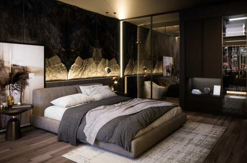
Additionally, understanding the intended mood of each room is vital. A bedroom, for example, should evoke relaxation and comfort, making soothing colours preferable. Choosing the right palette can create a desired ambience that aligns with the activities and feelings associated with each space.
Building Your Perfect Colour Scheme
Creating a fitting colour scheme involves understanding colour families, their temperature, and how to combine them effectively. An appropriate approach can enhance the visual appeal of any home, creating spaces that feel cohesive and inviting.
Exploring Colour Families And Temperature
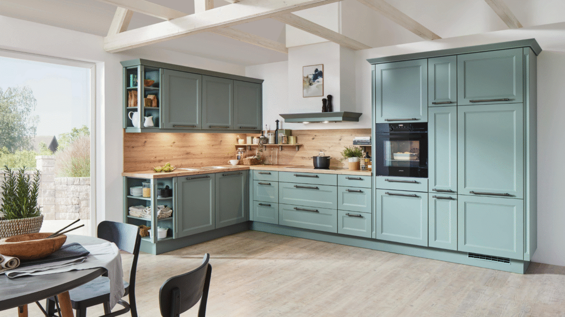
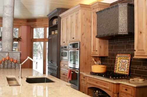
Colour families are grouped by similarities and can be classified into warm and cool colours. Warm hues like reds, yellows, and oranges bring a feeling of energy and intimacy, making them suitable for living rooms and dining areas. Cool colours, such as blues, greens, and purples, impart a tranquil atmosphere, ideal for bedrooms and bathrooms.
Temperature affects the room’s mood. Warm colours can make spaces feel smaller and more welcoming, while cool colours tend to expand a space visually. It’s vital to consider how these colours will interact with natural light throughout the day, as lighting can drastically change their appearance.
Complementary And Harmonious Combinations
Complementary colour schemes involve pairing colours opposite each other on the colour wheel, such as blue and orange. This combination creates visual interest and energy, making it ideal for accenting specific areas or features in a room.
Harmonious colour combinations are based on colours that are adjacent on the colour wheel, like blue and green. These palettes produce a cohesive look that feels balanced and calm. Choosing a dominant colour from one family and adding accents from another can create depth and interest without clashing.
Using Accent Walls And Feature Colours
Accent walls serve as a focal point in a room, using a bold paint colour to draw attention. Selecting a richer or darker shade than the rest of the room creates a dramatic effect. Common choices for accent walls include deep blues, vibrant reds, or textured wallpapers.
Feature colours can be used in accessories, furniture, or art to highlight the colour scheme. Mixing these carefully can provide layers of visual interest. For example, if the primary colour is a soft grey, adding warm hues through cushions or art can bring warmth without overwhelming the space.
Practical Steps And Inspiration
Selecting the right colour palette involves a combination of visual inspiration and practical evaluation. Here are essential steps to refine colour choices and draw motivation from existing designs.
Creating A Mood Board
A mood board serves as a visual summary of colour ideas, textures, and themes. To create one, gather samples of colours, materials, and images that resonate with the desired vibe.
- Use magazines, fabric swatches, and paint chips.
- Organise items based on colour families, such as earthy shades and terracotta.
This allows for a clear view of what combinations work together. The mood board aids in decision-making by providing context for colour pairings and room aesthetics.
Testing Paint Samples And Finishes
Before committing to paint, testing samples on the wall is critical. This helps to see how colours appear in different lighting conditions throughout the day.
- Purchase test pots of preferred shades.
- Apply them in patches on the wall to observe variations with light.
Consider various paint finishes as well; matte, satin, and gloss can change how colour reflects in a room. This stage is vital for understanding the depth and mood created by colour selection.
Drawing Inspiration From Real Homes
Exploring real homes can spark innovative ideas for colour schemes. Visiting local showrooms, open houses, or online platforms can provide practical insights.
- Look for colour inspiration in various settings, from contemporary flats to traditional houses.
- Focus on how colours integrate with furniture and decor.
Such exploration sheds light on functional applications and trends, allowing for informed and personalised choices in colour palettes.


You May Also Like

Why Renting a Dumpster is Perfect for Post-Hurricane Cleanup
7 Things You Should Consider Remodeling Your Kitchen For