
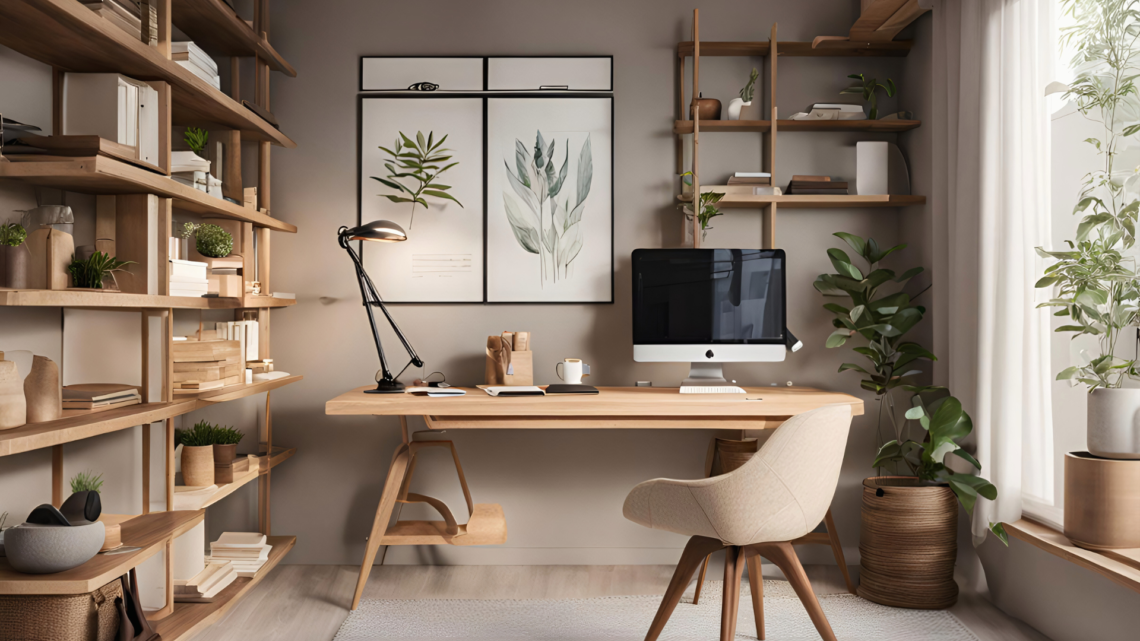
How to Make a Small Room Feel Bigger with Paint Techniques for Spacious and Bright Interiors
Small rooms can often feel cramped, but paint is a simple and effective way to create the illusion of more space. Choosing the right colours and techniques can significantly open up the area without any major renovations.
Using light, neutral colours and strategic painting methods can make a small room appear larger and more inviting. These choices reflect more light and create a sense of depth, helping to visually expand the space.
Different painting styles, such as using vertical or horizontal stripes, can also influence the perception of height and width. Understanding these options allows homeowners to tailor their approach for the best results in their specific room.
Fundamental Painting Principles for Enlarging Small Rooms
Using paint strategically can help maximise the perceived space in a small room. Choosing the right colours and finishes ensures light is captured and reflected, while careful colour transitions and tone selection create a sense of openness and depth.
Importance of Light Colours and Reflective Finishes
Light colours like whites, creams, and pastels reflect more natural and artificial light, instantly brightening a small room. This increased brightness makes walls appear to recede, giving the impression of a larger space.
Reflective finishes such as satin or eggshell subtly bounce light around the room. Matt finishes absorbing light and can make walls feel closer or heavier. Applying a slightly glossy paint on ceilings or trims helps lift the space visually.
Using light colours on all walls avoids visual breaks and stops a room from feeling boxed in. This approach is critical for making a small room look bigger.
Monochromatic Colour Schemes and Seamless Transitions
Monochromatic colour schemes use variations of a single colour to create an uninterrupted flow between walls, floors, and ceilings. This lack of contrast reduces visual distractions and prevents abrupt changes, helping the room feel more expansive.
For example, pairing pale blue walls with a slightly darker blue on the trim extends the line of sight. This smooth transition tricks the eye into perceiving a continuous, larger area.
Ceilings painted in a matching or lighter shade than the walls maintain height. Avoid harsh colour borders, which break the space into smaller segments and emphasise the room’s compactness.
Strategic Use of Cool Tones for Increased Depth
Cool tones such as soft blues, greens, and greys tend to recede visually, creating the illusion of space moving further away. Applying these colours to walls can simulate depth in a small room.
These colours complement natural light well, reducing shadows and enhancing brightness. Combining cool tones with light reflective finishes increases this effect.
However, too dark or overly saturated cool shades can shrink a room, so choosing muted or pastel versions is essential. Cool tones also work well with monochromatic schemes to maximise a small room’s airy feel.
Accentuating Space Through Paint Techniques
Using paint strategically can transform a small room’s dimensions visually. Techniques like consistent colour application, smart ceiling and trim painting, and patterned effects all influence how spacious the room feels.
Colour Drenching to Dissolve Visual Boundaries
Colour drenching means painting walls, trim, and sometimes ceilings in the same or very similar hues. This uniform approach removes visual breaks, making the room’s edges blend and the space seem larger.
Choosing lighter tones such as pale blues or soft greys enhances this effect. Dark colours can also work, but should maintain consistency across surfaces. The key is avoiding contrast, so no stark lines disrupt the continuous flow of colour.
Painting Ceilings and Trim for Height Illusion
Painting ceilings the same colour or a lighter shade than the walls can create an impression of height. This draws the eye upward, increasing the perceived vertical space.
For trim, using the wall colour rather than contrasting white reduces the feeling of boundaries. A subtle tone-on-tone approach to trims further opens the room by integrating details into the overall colour scheme.
Utilising Stripes and Patterns to Manipulate Perception
Vertical stripes on walls can visually raise the ceiling, adding height perception. Narrow stripes in soft colours work best to avoid overwhelming the space.
Horizontal stripes, if used lightly, can make walls feel wider, but must be applied carefully due to potential crowding effects. Subtle, repetitive patterns amplify depth when colours are harmonious, and lines are clean. Patterns should never dominate, but support the small room to look bigger.
Enhancing Spaciousness with Accent Walls
Accent walls can define a room’s shape and highlight its best features, making a small space feel larger. Strategic placement and colour choice are essential to harness the full potential of accent walls for visual expansion.
Choosing Accent Wall Placement for Depth
Placing an accent wall at the far end of a small room can create an illusion of depth, drawing the eye away from the room’s limited dimensions. This technique visually extends the space, making it appear longer or deeper.
Walls with architectural features, like windows or fireplaces, serve as natural candidates for accent walls. Avoid placing the accent wall on the shortest wall to prevent the space from feeling more confined.
Corner walls can also add dimension if painted thoughtfully. It’s important that the chosen wall is visible from the main viewing angles to maximise its impact on making the room look bigger.
Selecting Colours for Visual Expansion
Light, cool colours like soft blues, greens, and greys can open up a room when used as accent walls. These hues reflect more light, enhancing the sense of airiness and space.
While dark colours often shrink rooms, using them strategically can add depth without overwhelming the space. A deep navy or charcoal accent wall can create a focal point that visually pushes back the wall and increases perceived space if balanced with lighter surroundings.
Avoid overly bright or vivid colours, which may dominate the room and reduce the feeling of openness. Matte and eggshell finishes work best as they minimise glare and help maintain a subtle expansion effect.
Contrasting Versus Coordinating Accent Walls
Contrasting accent walls use a colour notably different from the other walls, creating a clear focal point and visual separation in the room. This can emphasise depth but risks making the space feel fragmented if too stark.
Coordinating accent walls use shades within the same colour family or similar tones, blending more gently with the room. This approach softens the boundary between walls, keeping the space visually unified and enhancing flow.
A middle ground is to use contrasting colours but keep them harmonious by matching undertones. For example, pairing a muted green with a soft sage can maintain contrast while supporting a sense of spaciousness.
| Approach | Effect on Space | Suitability in Small Rooms |
| Contrasting | Sharp focal point | Use sparingly to avoid fragmenting |
| Coordinating | Seamless expansion | Ideal for smooth, open feel |
| Balanced Contrast | Visual interest + unity | Works well for modern, subtle depth |
Common Mistakes and Additional Tips for Small Rooms
Small rooms require a careful balance of colour, light, and decor to avoid feeling cramped. Mistakes in paint colour or neglecting to test options can reduce the impact of design choices. Thoughtful integration of lighting and furnishings further enhances the sense of space.
Avoiding Overuse of Dark Colours
Dark colours can create a cosy atmosphere, but often make small rooms feel even smaller and more confined. Using dark paint on all walls tends to absorb light and reduce spatial perception. Instead, applying dark colours to one accent wall can add depth without overwhelming the space.
It is important to reserve dark shades for ceilings or smaller areas where they create contrast without closing in the room. Pairing dark colours with plenty of natural light or bright, reflective surfaces complements the paint and prevents the space from feeling too enclosed.
Testing Paint Choices before Application
Paint colours often appear different indoors compared to samples or images. Testing paint on different walls in various lighting conditions helps to avoid surprises once fully applied. Samples exposed to daylight, artificial light, and shadows give a reliable sense of how the colour changes throughout the day.
Applying swatches on multiple walls shows the paint’s interaction with the room’s layout and decor. This method is essential for small rooms where a wrong colour choice can visually shrink the space. Taking time to assess paint under realistic conditions ensures a better final result.
Integrating Decor and Lighting with Painted Surfaces
Paint alone does not determine room perception; furnishings and lighting are equally influential. Matte or satin finishes reduce glare, making walls appear softer and more open. Glossy paints reflect light but can highlight imperfections, so their use should be strategic.
In small rooms, combining paint with well-placed lighting – such as wall sconces or recessed lights – brightens corners and expands visual space. Mirrors and light-coloured furniture complement painted walls to enhance the feeling of openness. Proper coordination between paint, decor, and lighting maximises the room’s potential.

You May Also Like
Make the Most of Your At-Home Space: Tips for Setting up a Flex Room
The Cost Of Designing A Room: How Much Does It Really Cost?